2 simple software tips that will improve your life
I was just taking a break from sorting through the mountain of email in my inbox, and I found a fantastic (and very well timed!) tip for Microsoft Outlook.
You know how some people reply to emails over and over again, without changing the subject line, so that the content of the message eventually has nothing to do with the title? Well, grumble no more! To make it much easier to tell what a message is actually about when you're scanning your email inbox, check out this handy little how-to from Lifehacker (a fantastic tips blog, by the way):
And while we're on the topic of helpful software tips, if you have Windows XP, for heaven's sake, reduce your eye strain by turning on ClearType!
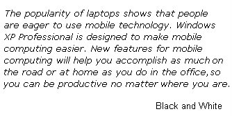
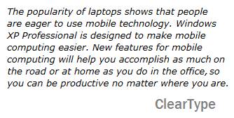
ClearType is a Windows XP feature that smoothes the edges of fonts to make them easier to read. It's great for people like me who spend their days in front of a computer. I recently turned on ClearType on my Mom's computer, and she found it to be a big difference.
To turn on ClearType:
- Go to Start > Control Panel > Appearance and Themes > Display
- Click on the Appearance tab, and the Effects button
- Check the box next to "Use the following method to smooth edges of screen fonts", and select ClearType from the drop-down menu
- Click OK, then Apply, and OK
Before and after:


Technorati tags: Microsoft, Outlook, Windows XP, software tips
Posted in: helpful tips, household on June 14, 2006


I have an even simpler way...buy a Mac...;)
lol, okay, simple tips for those of us who can't afford a new computer. ;)
Did you realize that you have the images of the two boxes of type hard-coded to be shown at slightly different sizes than the native sizes of the images, so they're both slightly distorted?
To fix: go into the HTML of the post, take "width: 340px; height: 171px;" out of the first img tag, and "width: 327px; height: 165px;" out of the second. They'll then both appear in the post the same way they do when you click on them to view them separately.
That said, I think it depends on the font and point size as to how much difference ClearType makes. Worth experimenting though.
heather > good tip, thanks! I fixed the size.
No trouble. Glad my instructions were sufficiently clear. Looks fine now.