New MUN website
Memorial University (of Newfoundland) has launched its new website.
Posted in: MUN, Newfoundland on December 04, 2006 1 comments
Memorial University (of Newfoundland) has launched its new website.
Posted in: MUN, Newfoundland on December 04, 2006 1 comments
I have a million things bookmarked that I want to share, but haven't gotten around to yet. I'm heading off on vacation soon *happy dance*, so I'll try to cram a bunch of it into the next few posts.

Posted in: helpful tips, MUN, Newfoundland, videos on June 29, 2006 0 comments
The petition to keep Newfoundland in MUN's logo has surpassed its goal of 1000 signatures, and is still going strong, despite an attempt in The Telegram to discredit the petition (The article isn't online, but I'll type it out sometime soon). There are many well-written, passionate comments on the petition. Here are a few:
"Having read all of the university's official answers, I still don't see the need to change the name of the university in a new ad campaign. The university can huff and puff about being "misunderstood" all they like, but if we, the people who already know and love MUN can "misunderstand" them, that's only greater proof that they are misrepresenting our university to the rest of the world." - #1012A response from from Marketing and Communications can be found in the comments to my last post.
"Memorial University of Newfoundland has prospered as a result of the quality of the students produced at the institution, most of whom are Newfoundlanders. To drop “Newfoundland” for the university’s name, to distance the institution from its roots, is an insult to all Newfoundlanders." - #936
"Who would want to take Newfoundland out of anything? Memorial should be proud to say... of Newfoundland." - #915
"Newfoundland is quickly losing the heritage/culute many of us hold dear. Please do not interfere with our university name and logo. What possible advantages are there to such a change???" - #787
"Please keep Newfoundland in the university's name in all promotional material and please keep the old logo --it may not be modern "art" but it is clear and dignified." - # 217
"The university is in Newfoundland and is part of our province's history and culture. We should be proud of who we are and where we come from." - #749
"Our university isn't just any Memorial University, it is the Memorial University of "Newfoundland". The establishment of this institution and the strides it has made over the decades to become the largest university in Atlantic Canada are a testament to the strides our province has made. Don't rob past, present and future students and faculty of the pride that is linked to the name as it stands, and the place that it stands for, our home...Newfoundland." - #734
"...Newfoundland and Labrador defines who and what we are, Memorial University of Newfoundland can only reflect that if we keep Newfoundland in its name." - #427
"Like everyone on this list I identify and am proud of MUN. Until we are presented with a logical argument demonstrating the pros and cons for a name change/logo change, we would like to keep our Newfoundland University name as MUN. Further, if we are presenting a unique cultural and academic experience of Newfoundland to the global community, why impose a disconnect by branding us with a generic stamp. I just don’t get it…" - #281
"...To the boys who went over the top and never came home, we appreciate it, and so should Memorial University of Newfoundland." - #637
"Without “Newfoundland” there is no memorial." - #379
"The words "of Newfoundland" are integral to of our University's history and founders. The name of a university is based on tradition and should not be adjusted to suit a marketing campaign." - #81
"Memorial University of Newfoundland was named in memoriam of the brave and fine Newfoundlanders who gave their lives so we could enjoy times of peace. We were, at the time, an independent country - not connected with Canada. I am proud of my heritage. As a graduate student at MUN, my wish is to keep the name as it is. The words, "Lest we forget" should be embraced. OUR SMALL COUNTRY OF NEWFOUNDLANDERS LOST A WHOLE GENERATION OF MEN. It's their memories we honour. Let's choose our naming conventions carefully. Logos, no doubt, are important marketing techniques designed to catch and hold our attention so we will make associations with them and remember. Why remove such an important part?" - #620
"...Universities are based on traditions, and familiar, easily recognizable icons are essential to the development and maintenance of traditions. It has been decided, by a small group of people, that we will abandon the use of this traditional and revered icon to facilitate a promotional campaign." - #436
"Our University was built as a Memorial to fellow Newfoundlanders who gave their lives for us. It is their Memorial and Newfoundland should never, never be removed." - #268
"I guess if you think an institution's noble origins are boring and a bummer, then it's okay to take the crest representing them out of the logo. But leaving out the location? Why bother doing something that will doubtless be confusing and controversial, unless there is some compelling reason not to advertise where MUN is? I have heard no such reason as yet." - #288
"There's an important difference between 'rebranding' and changing your identity - MUN is a major part of Newfoundland, and Newfoundland history and tradition are a major part of the university. In a time when we have to fight so hard to keep our Newfoundland culture from disappearing, I find it appaling that one of the great institutions that was built to preserve our history would even consider changing it's identity simply as marketing ploy." - #529
"Born and raised Newfoundlander who believes in never taking the word out of anything ever, ever, ever." - #910
Posted in: MUN, Newfoundland on June 26, 2006 3 comments
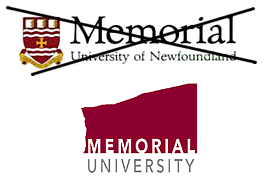 The Graduate Students' Union at Memorial University of Newfoundland has issued a statement voicing its displeasure with the university's new marketing campaign, and in particular, the new logo. While the GSU news release is not available on MUN's website, the Marketing & Communication department's press release, and response to the GSU are.
The university takes issue with the GSU's statement, and states that its "goal in this marketing initiative is to build on the strengths of Memorial University, to make it stronger for your benefit as students and for the benefit of the entire province".
By now you all know my opinion. While I think it's great that Newfoundland photos, etc. will be used in the marketing campaign, I have not yet heard an argument that convinces me that removing Newfoundland from the logo is necessary or beneficial. I'm not the only one who feels this way. In the past two weeks, over 850 people have signed a petition saying that they want Newfoundland kept in the logo. The university has said it would like to have feedback from the university community. Maybe 850 letters need to be written to have an impact.
Marketing & Communications: marcomm@mun.ca
MUN president Axel Meisen: munpres@mun.ca
Alumni Affairs: munalum@mun.ca
Members of the Board of Regents (including alumni & student members): http://www.mun.ca/regents/members.php
The Muse editor John Rieti: chief@themuse.ca
The Gazette: gazette@mun.ca
Technorati tags: Newfoundland, MUN, Memorial University of Newfoundland, logo, St. John's, Canada
Posted in: MUN, Newfoundland on June 22, 2006 7 comments
 Ahhh... it was a lovely weekend here, filled with sunshine, time with friends, good food, and lots of time outdoors. Hubby & I spent the entire day gardening yesterday, and I haven't slept so soundly in a long time! Our gardens are looking really good now, and our neighbors are starting to think that we're not really the hermit couple after all.
A particularly unpleasant appointment this week has been postponed too, so even though it's probably prolonging the inevitable, it feels good not to have to worry about it this week (I know, that's rather cryptic, but I'll explain another time).
I didn't watch the news or turn on the computer this weekend, so I was surprised to hear that two PEI farms have been quarantined for bird flu investigations. Eeep, that's close to home. Hubby's family lives in PEI and I work for a company based in Charlottetown.
We saw X-Men: The Last Stand on Thursday, and while it wasn't the best of the series, I enjoyed it.
On the Memorial University of Newfoundland front, the petition to keep Newfoundland in MUN's logo now has 554 signatures. The MUN Senate meeting on Thursday included discussion about the new marketing campaign, and many of the student senators were vocal during question period, taking issue with the removal of Newfoundland from the logo.
I added a couple more posts in the list of commentary about the new MUN logo (scroll down to the end of the post).
And just out of curiosity, last week I put together this collage of university logos (click to enlarge).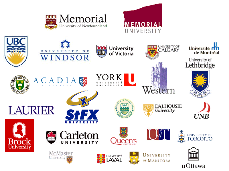
*Disclaimer: This is not a complete representation of Canadian university logos, and I can't guarantee that I haven't made a mistake and included an unofficial logo. For instance, I included 2 UofT logos, because I suspect the blue & red one is their most current. The logos are all different sizes, and are listed in no particular order.
Technorati tags: bird flu, X-Men, MUN, Memorial University of Newfoundland, Newfoundland, St. John's, logo, marketing
Posted in: MUN, Newfoundland on June 19, 2006 1 comments
Updated:

Posted in: MUN, Newfoundland on June 15, 2006 2 comments
Updated
It seems that the 'powers that be' at MUN are listening, and have changed the text of the Research Report!
I mentioned in an earlier post that while the Government of NL is mentioned in the text of the website, the official name of the university was not used. It was just called "Memorial University", even in the copyright notice.
Now the text references in the Research Report to "Memorial University" have been changed to "Memorial University of Newfoundland". Good move.
For those of you who are wondering, the logo still does not contain Newfoundland, and the new university calendar is still the same.
Update: Marketing & Communications has let me know that "of Newfoundland" was left out of the text of the website in error. The original brochure for the Research Report mentioned the official name of the university many times. After it was brought to their attention, Marketing & Communications contacted the website administrators to fix the error.
Thanks for the info!
Technorati tags: Newfoundland, MUN, Memorial University of Newfoundland, logo, St. John's, Canada
Posted in: MUN, Newfoundland on June 13, 2006 0 comments
The petition to keep Newfoundland in MUN's logo has 76 signatures (as of 11:20am Atlantic time).
The list of articles about the logo change is still growing...
Sure B'y posted a link to MUN's description of the symbolism of the crest/coat of arms on the university's current/old logo:
"The Arms of Memorial University have as their central element a cross moline, which is a fitting symbol for an institution dedicated to the memory of soldiers of Newfoundland who died during the Great Wars. The cross is the supreme symbol of sacrifice and its anchor-shaped ends signify the hope that springs from devotion to a good cause. The wavy bars above and below allude to the maritime setting of the university, while the three books in the upper part of the shield are a reference to its educational role.
The motto Provehito in Altum (Launch forth into the deep) captures the spirit of the adventure of learning and urges students to extend the frontiers of knowledge.
Claret and white, derived from the cross of St. George, were the colors of the Royal Newfoundland Regiment during the First World War. Red is a symbol of courage and sacrifice, white is the colour of purity, and gold is associated with nobleness and magnanimity. While paying tribute to the bravery of the soldiers of Newfoundland, these colors remind all that courage tempered with mercy can be enlisted in the service of pure and noble causes."
(Excerpted from the program of the Ceremony for the Presentation of the Coat of Arms to Memorial University of Newfoundland. Friday, September 18, 1992)
Being from Ontario, I can comment on your "bias".
Of course each province has a culture of their own, but I have never met a people more proud of their province than Newfoundlanders. When I've been around the country, I don't tell people I'm from ON. I tell them I'm from Ottawa (which may be the difference in living in a recognizable city!) There is a connection that you (meaning Newfies) have with your "land" that goes beyond regular provicial loyalty. Having visited there as a mainlander, I can see why. It's very easy to fall in love with Newfoundland.
Posted in: MUN, Newfoundland on 1 comments
A.K.A. Memorial University no longer "of Newfoundland", Part IV
Updated
Just came across this petition this weekend. There aren't many names yet, so pass it around!
(Javascript won't work, so click on the image to go to the petition) The list of related posts/articles was last updated on Friday.
Here's a link to MUN's 2006-2007 university calendar, with the new branding.
Also check out the online Research Report, with the new branding. I found this link on the survey's info page. I actually kind of like the colour scheme, but find it unsettling that while the Government of NL is mentioned, the university is just called "Memorial University" - no Newfoundland.
The MUN logo change is now a Hot Topic for discussion over at Newfoundlanders Abroad.
Posted in: MUN, Newfoundland on June 12, 2006 2 comments
On Monday I wrote an article about why I disagree with the Memorial University of Newfoundland's new logo.
Many bloggers have commented on the issue, and I'm keeping an updated list of them below my article. If you'd like to read them, click on the link above and scroll down to the bottom of the post. If you know of other blog posts or articles to add, let me know in a comment. Thanks!
Technorati tags: Newfoundland, MUN, Memorial University of Newfoundland, logo, St. John's, Canada
Posted in: MUN, Newfoundland on June 07, 2006 0 comments
June 23rd: Updated again!
This weekend I received a copy of the Memorial University of Newfoundland's latest Alumni e-newsletter, Luminus Express, and it contains a link to information about MUN's new logo.
I've previously expressed disappointment about the university's choice for a new logo, which I still hold, even after correspondence with the university's Marketing & Communications staff. I posted about this issue before, but I would like to re-state and expand upon my opinions.
For those of you who aren't aware of the issue, the Memorial University of Newfoundland has created a new logo, in which the university is represented simply as "Memorial University" - no location.
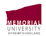 Not only was the university named in memory of Newfoundland’s WWI and WWII veterans, but it is the location of the university - an important fact. Although the legal name of the university has not changed, and the crest and full name will still be used for ceremonial purposes, I think it is unwise to use a logo without the words “of Newfoundland” in it. There are many reasons for this:
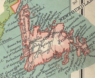 The opinion has been raised that adding “of Newfoundland” to the logo would make it more confusing. I wholeheartedly disagree, and I believe that leaving out the location will in fact cause confusion. Newfoundlanders all know where “Memorial University” is, but most people from other parts of the country, and certainly internationally, will have no idea where "Memorial University" is when they see the logo on a sweatshirt, backpack, or in any other situation when additional text and photos are not present. The inevitable question will be “Where is that?”.
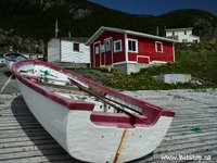 While I understand the desire to have a short, simple, and easy to reproduce logo, I do not believe that the addition of the location to the university’s logo would be counter to these goals, although I admit that it would make the logo slightly longer/larger. To be blunt, and perhaps it is just my opinion, but “Memorial University” sounds bland and non-descriptive. Brock and Dalhousie, while they are not the official names of the university, are more distinctive names, and less likely to be confused with other universities and locations. And while people refer to the university as “MUN” and “Memorial” in conversation, when they are speaking with someone who they think will not have heard of the university, they usually mention the location; either “Memorial University of Newfoundland”, or something along the lines of “Memorial University, it’s in the province of Newfoundland, Canada” or “MUN, in Newfoundland”.
 A sense of home and community is very important to Newfoundlanders. While the campaign’s incorporation of local places, people, uniqueness and strengths is to be commended, it just feels wrong not to use Newfoundland in the logo. Perhaps my emotions are too involved, but I believe that others feel the same way. I still wear my MUN sweatshirt with pride; with much more pride, in fact, than I wear my UNB shirts. That's because Newfoundland is in my blood, and my four years at MUN were an amazing experience. We Newfoundlanders are proud of our home, and we like for others to know where we are from; more so, it seems, than people from most other provinces. Although I am sure it was not the intention of the university decision makers, removing “of Newfoundland” from the logo seems to be disregarding the importance of our heritage in all things we do, and I do not foresee the same pride in a logo that simply says “Memorial University”.
 A logo is a device to tell part of a story, but our location is the essential first sentence of our tale. In fact, our location is often the element that piques people to ask more – I’m sure every Newfoundlander has mentioned Newfoundland to people from other parts of Canada and the world, and received the response “Oh, I’d love to visit there someday!”, which leads to a conversation about the province. The university’s marketing campaign will elaborate on the message in the logo, but this does not mean that Newfoundland should not be included in the logo. There is much more to our story than our location, which the campaign will illustrate.
 From what I understand, the representation and name of the university has been a controversial issue for some time, and it seems that there is more to lose in removing those words from the logo than in keeping them. To rephrase and make my meaning more clear: it seems that more people will be upset with Newfoundland removed from the logo, than the number that would be upset if Newfoundland remains in the logo.
Posted in: MUN, Newfoundland on June 05, 2006 10 comments
Updated
Arrrggghhh, this pisses me off. The Memorial University of Newfoundland (my alma matter) has created a new logo for their marketing campaigns, which doesn't include the province name!
It seems so silly to simply promote "Memorial University" - Newfoundlanders will know where it is, but most people across Canada (and certainly internationally) will have no idea where the school is, or who it is a memorial to. Add that to the fact that there are about a half dozen other Memorial Universities in North America (Florida Memorial University, Lincoln Memorial University, etc.)... this just doesn't seem to be an effective branding strategy.
The old logo:The new logo:
While the official name of the university remains "Memorial University of Newfoundland", this logo will be used to promote the school. I don't like the new logo all that much, but I realize that graphics change, and it's not that big a deal to me. I really think "Newfoundland" should remain in the logo and marketing materials though.
Edit: My suggestion for changes to the logo - just add "of Newfoundland" to the bottom of the logo, in the same grey lettering, like this:
The university's name is a subject of debate for some people too, from what I understand. Some advocate adding "and Labrador" to reflect the province's recent name change, while others think it should remain simply "Memorial University of Newfoundland", because the school was named as a memorial to those who died serving Newfoundland in WWI and WWII, before entering Canada.
If you would like to voice your opinion on the new logo, you can email the university president Axel Meisen at munpres@mun.ca, and the university's marketing and communications group at marcomm@mun.ca.
Update: Read Memorial University no longer "of Newfoundland", Part II (June 5, 2006)
Cove Blogger has written a great post about the new logo, along with some background information on the name change issue.
Technorati tags: Newfoundland, Memorial University of Newfoundland, St. John's, MUN, logo, marketing, Canada
Posted in: MUN, Newfoundland on May 30, 2006 5 comments


